Visual Identities


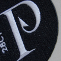
The Film and TV Academy of the Adriatic Region, founded by the members of the Festival Network of the Adriatic Region: Sarajevo Film Festival, Belgrade Original Film Festival and Zagreb Film Festival, announces the nominees for this year's winners of the AFA awards, the Adriatic Film Awards. With these awards, the Academy recognizes the most significant film productions and TV series from the territory of the former Yugoslavia.


The Film and TV Academy of the Adriatic Region, founded by the members of the Festival Network of the Adriatic Region: Sarajevo Film Festival, Belgrade Original Film Festival and Zagreb Film Festival, announces the nominees for this year's winners of the AFA awards, the Adriatic Film Awards. With these awards, the Academy recognizes the most significant film productions and TV series from the territory of the former Yugoslavia.

Rebranding of Curry Bowl, which after years of successful work in Zagreb entered a phase where it was necessary to redefine the identity for the expansion of the franchise on the European market. The basic elements of the new identity are accompanied by charming illustrations that interpret the sights of Sri Lanka.
coauthor:
Hana Vrca
collaborators:
Maja Draganić
Klara Zaher
Monika Markić

AMC (The Aesthetic Medicine Congress) is the leading regional congress in aesthetic medicine, bringing together world-renowned experts. For its 7th edition, the existing elements of the visual identity have been given a third dimension, abstractly representing key areas of the field. These elements form the foundation of the branding across print, digital, and spatial formats.
coauthor:
Hana Vrca
animator:
Manuel Šumberac
composer:
Stjepan Tribuson

The concept of the visual identity of the Paninaro sandwich bar is based on the idea of a place to gather and enjoy quality paninis inspired by Italian schiacciata sandwiches. Dubrovnik Paninarci were created, which look like the people of Dubrovnik and enjoy delicious sandwiches on the go. The name was inspired by the subculture of young Italians in the 80s in Milan who stood in front of Italian panini bars and propagated fast food, expensive brands, cars, synth and enjoyment of life. The project was created in collaboration with the architectural office Proto-arch, which was in charge of the architecture of this delicate space within the walls of Dubrovnik.
coauthor:
Klara Zaher
project manager:
Maja Draganić
architecture:
Proto-arch

The Captain's House is a legendary restaurant from Mali Ston known for its oysters and local cuisine. The Dubrovnik architectural studio Proto-arch is responsible for the interior renovation, and a new visual identity project is also planned for the space. The sign was created from the restaurant's initials, the letter 'K', which was designed to resemble the profile of a mustachioed captain. Seafood illustrations were made as supporting elements.
coauthor:
Klara Zaher
architecture:
Proto-arch

Games Croatia is a project of the Croatian Audiovisual Center for the promotion and development of the Croatian video game industry on a national and global level. This initiative brings together the key stakeholders of the Croatian video game industry. Games Croatia promotes the Croatian video game industry at fairs, meetings and other events in Croatia and abroad. Through the action of this project, domestic video game producers and other stakeholders in the Croatian video game industry gain visibility and are encouraged and supported in networking with the international video game industry.
coauthor:
Hana Vrca

The Zagreb Soloists are the most respected Croatian chamber ensemble founded in 1953. They held over 4,000 concerts on all continents and recorded about 70 audio tracks.
animator:
Manuel Šumberac
composer:
Dalibor Grubašević


The Zagreb Soloists are the most respected Croatian chamber ensemble founded in 1953. They held over 4,000 concerts on all continents and recorded about 70 audio tracks.
animator:
Manuel Šumberac
composer:
Dalibor Grubašević

Zagreb Five is an international indoor soccer tournament for young people held in Croatia


Zagreb Five is an international indoor soccer tournament for young people held in Croatia

The traveling exhibition "The Euro on Wheels" is a special educational project as part of the informative campaign for replacing the Croatian kuna with the euro, which is being carried out by the Government and the Croatian National Bank, with co-financing from the European Union. The exhibition was held in 27 Croatian cities, and multimedia content and 'euro experts' provided visitors with all the relevant information about the introduction of the euro as an official currency.
Authors concept design:
Projektil d.o.o.
Novena d.o.o.
Clinica Studio d.o.o.
Šesnić&Turković d.o.o.
Igor Poturić
Authors of final design and construction:
Trotočka d.o.o.
Super Truper Mix d.o.o.
Kadei 360 d.o.o.
Spona digital d.o.o.
Modulee d.o.o.
Hust d.o.o.
Photographer:
Božidar Bengez
Photos are the intellectual property of the CNB.

In the Velebit Nature Park, at the foot of the entrance to the Cerovac Caves, there is a newly opened visitor research center. Along the center there are access promenades and paths in caves. Our task was to design and supervise the performance of visual identity, signaling and interpretive graphics.
coauthor:
Iva Sindik
architecture:
Normala d.o.o.
Roman Šilje, arhitekt
Tihana Vučić, arhitektica
Stjepan Smolčić, arhitekt
interpretational texts:
Kazimir Miculinić

Hard seltzer is a new type of drink on the Croatian market. Basically it's mineral water, with fruit aroma and 5% alcohol. Grin is the first craft hard seltzer on our market. As it is a new sector of light alcoholic beverages - it was important for the design to leave the right impression of what kind of drink it is. The target group are young active people.
Lettering:
Marko Hrastovec

Bio Boutique is a small family company that opened a shop with a curated selection of bio cosmetics. Selection is firmly based on natural, organic, certified ingredients - with absolutely no harmful additives.
Interior design:
Jana Piacun
photographies:
PSZ


Bio Boutique is a small family company that opened a shop with a curated selection of bio cosmetics. Selection is firmly based on natural, organic, certified ingredients - with absolutely no harmful additives.
Interior design:
Jana Piacun
photographies:
PSZ

Visual identity and packaging redesign for a popular herbal medicine.
project partners:
Star Digital


Visual identity and packaging redesign for a popular herbal medicine.
project partners:
Star Digital

Romb Technologies is a company specialized in navigation technology for automated guided vehicles and mobile robots.
coauthor:
Iva SIndik
Romb Technologies is a company specialized in navigation technology for automated guided vehicles and mobile robots.
coauthor:
Iva SIndik

Museum for Arts and Crafts in Zagreb celebrated the 140th birthday with a new branding. We are commissioned to design a new visual identity, and are working on a new communication style, signalisation, interpretation in the permanent exhibition, designing of souvenirs etc.
typography:
Brenner Sans by
Nikola Đurek
exhibition:
croatian design exhibition 1920
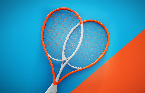
Marin Čilić Foundation organised a humanitarian tennis tournament with the goal of raising funds for multifunctional children sports playground in an underdeveloped part of Croatia. Many of Croatia's best athletes supported the cause, Luka Modrić and Mario Mandžukić among them.
collaborator:
Manuel Šumberac

Golden Stack is a pancake shop in Malaga. They are famous for their huge and rich stacks of pancakes.
coauthor:
Iva Sindik
interior design:
Nataša Ivanišević
designed as a member od+f
Pinch of design


Golden Stack is a pancake shop in Malaga. They are famous for their huge and rich stacks of pancakes.
coauthor:
Iva Sindik
interior design:
Nataša Ivanišević
designed as a member od+f
Pinch of design

Izone is one of the best Croatian digital agencies. This is a rebranding case in which we did a classic identity work and a set of illustrations and base for communication style.
coauthor: Andrea Sužnjević
collaborator: Iva Sindik


Izone is one of the best Croatian digital agencies. This is a rebranding case in which we did a classic identity work and a set of illustrations and base for communication style.
coauthor: Andrea Sužnjević
collaborator: Iva Sindik

This design is a public contest winner. Orlando's pillar is considered to be the oldest public sculpture in Dubrovnik. Our logo is a combination of the anniversary year, Orlando's famous sword and a flag.


This design is a public contest winner. Orlando's pillar is considered to be the oldest public sculpture in Dubrovnik. Our logo is a combination of the anniversary year, Orlando's famous sword and a flag.
Film Centre of Montenegro is a newborn nacional film centre. They hired us because they wanted designers that are not influenced with their usual nacional symbols. We merged two symbols to make a new logo - film projection light & black mountains.
Film Centre of Montenegro is a newborn nacional film centre. They hired us because they wanted designers that are not influenced with their usual nacional symbols. We merged two symbols to make a new logo - film projection light & black mountains.

Visual identity is based of the fact that Croatia has no design critique. There is a lot of design exhibitions in Croatia that give out awards to the best designers, but the critique is non existent. Main elements of the new identity are the laudatory tick and the negative cross mark. Their role is to engage the audience to express their thought about what is good design and what isn't. They have to know how to differentiate the two and learn how to express their beliefs.
coauthors:
Zita Nakić
Iva SIndik
Andrea Sužnjević
catalogue collaborator:
Barbara Bjeliš
event photographs:
Karla Jurić
Matej Jurčević
art installation authors:
Maja Subotić Šušak
Slavica Farkaš

IGH is one of the biggest and most distinguished domestic companies, specialized in civil engineering, consulting, supervision and science research. Our friends from Senor agency called us to work with them on the new visual identity design.
creative director
Vanja Blumenšajn
creative director, copywriter
Luka Pervan
junior copywriter
Zvonimira Milevčić
UX/UI designer
Miro Čavar
art direktor
Iva Sindik
strategic director
Iva Kaligarić
account managers
Danijela Maričević
Irena Lešković

A pinch of design is a collaboration between architects, interior designers, graphic designers (us), and cooks aimed at offering complete services of preparing and designing gastronomical facilities.
illustrator:
Tomislav Tomić


A pinch of design is a collaboration between architects, interior designers, graphic designers (us), and cooks aimed at offering complete services of preparing and designing gastronomical facilities.
illustrator:
Tomislav Tomić

Konavoski dvori is one of the most famous restaurants in Konavle, situated on the location of an old mill by the river Ljuta close to Konavle. The design of Konavoski dvori was done within the redesigning project of the visual identity of restaurants from the Esculap Teo Group.
exhibition:
Croatian Design Exhibition 1718

Orlando is a legendary bistro on Stradun, in the heart of Dubrovnik. In collaboration with the architect Lea Đurović Ruso, we designed all the communication materials and gave Orlando a new identity. The design of Orlando Café was done within the redesigning project of the visual identity of restaurants from the Esculap Teo Group.
exhibition:
Croatian Design Exhibition 1718

Duck is a bistro in the centre of Zagreb offering world-class food for affordable prices. In collaboration with our friends from the agency Senor, we designed Duck’s visual identity, all the identity applications in the bistro, as well as the labels for their house wines.
exhibition:
Croatian Design Exhibition 1718

Everything works is a company that promotes and distributes arthouse films. The name itself is so powerful and suggestive, we designed a logo that emphasizes the meaning of that name.


Everything works is a company that promotes and distributes arthouse films. The name itself is so powerful and suggestive, we designed a logo that emphasizes the meaning of that name.

Proto is a well-known and well-regarded seafood restaurant established in 1886. In 2015, we designed their new visual identity, and architect Lea Đurović designed a new interior, thus providing this hundred year old restaurant a new look.
exhibition:
Croatian Design Exhibition 1718


Proto is a well-known and well-regarded seafood restaurant established in 1886. In 2015, we designed their new visual identity, and architect Lea Đurović designed a new interior, thus providing this hundred year old restaurant a new look.
exhibition:
Croatian Design Exhibition 1718

In 2015 we designed the group visual identity ‘Parks of Croatia’. The identity is comprised of 19 individual visual identities for all Nature Parks and National Parks and the cover identity of ‘Parks of Croatia’. In our estimate, that is the most extensive design work done for state institutions in the last 10 years.
Coauthors of the Project of interpretation and communication in nature in the framework of the EU NATURA 2000 integration project:
Dragana Lucija Ratković Aydemir, Muze d.o.o. Zagreb
Vedran Kasap, Clinica studio d.o.o. Zagreb
Igor Pauška, Zagreb
Marko Šesnić, Šesnić&Turković, Zagreb
Goran Turković, Šesnić&Turković, Zagreb
Vladimir Končar, Revolucija dizajna d.o.o. Zagreb
authors of the identity:
Marko Šesnić
Goran Turković
Andrea Sužnjević
film authors:
production: Eclectica
producer: Rea Rajčić
editor: Tomislav Stojanović
director of photography: Ante Cvitanović
animator: Manuel Šumberac
sound design: Tihomir Vrbanec

Eclectica is a Croatian production and postproduction company. Eclectica’s goal is to produce with dedication the most diverse projects within the audiovisual media. Since they aren’t focused on a single film genre, television format or commercial film – we designed a fairly eclectical visual identity. The logo has countless variants, with different designs, colours and texture, but despite all that diversity, the visual identity has a clear uniformity.


Eclectica is a Croatian production and postproduction company. Eclectica’s goal is to produce with dedication the most diverse projects within the audiovisual media. Since they aren’t focused on a single film genre, television format or commercial film – we designed a fairly eclectical visual identity. The logo has countless variants, with different designs, colours and texture, but despite all that diversity, the visual identity has a clear uniformity.

The Yellow Copy Shop is literally a yellow house with a copy shop.

The Yellow Copy Shop is literally a yellow house with a copy shop.
Fogo is a marketing agency based in Dubai. Fogo is an acronym for ‘Fear of going out’, which in the context of a marketing agency has an ironic undertone. With that in mind, we made a logo featuring a periscope instead of the initial letter.


Fogo is a marketing agency based in Dubai. Fogo is an acronym for ‘Fear of going out’, which in the context of a marketing agency has an ironic undertone. With that in mind, we made a logo featuring a periscope instead of the initial letter.

Emma&Nala is a Croatian maker of unique, hand-made women’s jewelry. They hired us to design their brand’s visual identity and packaging.


Emma&Nala is a Croatian maker of unique, hand-made women’s jewelry. They hired us to design their brand’s visual identity and packaging.

In 2016, the university college of Economics, Entrepreneurship and Management Nikola Šubić Zrinski developed a strategy to promote 4 local administrations on the island of Pag. Within that strategy, we designed the group visual identity for the island of Pag, the city of Pag, the city of Novalja and the Kolan and Povljana districts. The aim of the group visual identity is to increase the communication strength of the complete tourist offer of the island of Pag because Pag (like many Croatian islands) is small enough for an average tourist to experience it whole during their short stay. Unfortunately, the whole group visual identity project was not implemented whole, but some parts are in use.
coauthor:
Petar Boban
collaborator:
Andrea Sužnjević

Bocca Buona is a chain of Italian restaurants owned by the Rezidor Hotel Group. Bocca Buona can be translated into English as "good mouth" or "good mouthful". The restaurant offers authentic Italian cuisine at affordable prices. Our colleagues from architecture studios A&A and OG designed the interior, and we designed their visual identity and spatial graphics.
co-author:
Andrea Sužnjević
collaborator:
Manuel Šumberac
interior design:
A&A / OG
Nataša Ivanišević
Sandra Barcons Planella
Jordi Parcet Comas

Proto-arch is a Dubrovnik based architecture office.
coauthor:
Andrea Sužnjević


Proto-arch is a Dubrovnik based architecture office.
coauthor:
Andrea Sužnjević

Winkel [ˈvɪŋkl̩] in German means “corner”. In Zagreb and Zagorje “vinkl” means “right angle”. The restaurant’s logo is designed in several angles and is used in the right angle wherever possible.


Winkel [ˈvɪŋkl̩] in German means “corner”. In Zagreb and Zagorje “vinkl” means “right angle”. The restaurant’s logo is designed in several angles and is used in the right angle wherever possible.

The crest for the futsal club Futsal Dinamo. The crest had to contain the Dinamo Football Club logo and we incorporated the number of players in a futsal team.

The crest for the futsal club Futsal Dinamo. The crest had to contain the Dinamo Football Club logo and we incorporated the number of players in a futsal team.

Archeology and architecture is a Spanish-Croatian architectural bureau whose work is primarily in the field of conservation architecture. The bureau designs the renovation of old, protected architecture into which they incorporate contemporary architecture.
exhibition:
- 2014. Croatian Design Exhibition 1314

Fakat is one of the biggest rental companies in Croatia and an event agency. We designed their visual identity and produced a series of illustrations.


Fakat is one of the biggest rental companies in Croatia and an event agency. We designed their visual identity and produced a series of illustrations.

Kavanica is a café bar in Varšavska Street in Zagreb, decorated in the manner of old Zagreb coffee houses. The owners wanted to offer the feel of legendary coffee houses from the age of top hats and tuxedos.
co-author: Marinko Murgić


Kavanica is a café bar in Varšavska Street in Zagreb, decorated in the manner of old Zagreb coffee houses. The owners wanted to offer the feel of legendary coffee houses from the age of top hats and tuxedos.
co-author: Marinko Murgić

Sky Office is a Zagreb business centre, which is made up from two oval skyscrapers. The visual identity and signage are based on stylized raster of floors and windows of the skyscraper in such a way that one skyscraper is coded with horizontal lines, while the other is coded with vertical lines. That code is systematically carried out on all the elements of the identity; from the reception to the signage. The logo changes depending on its position – the location of the skyscraper in the logo corresponds to the perspective from which the buildings are observed.
Reception co-designers: Nikica Tabain & Nikola Šimunić

In 2010 eight countries of south-eastern Europe decided to take part at the Cannes Film Festival Market together, and have continued to do so since then. The visual identity of SEEP is designed to change every year, but within the same graphic language. The design itself is based on the work of Eadweard Muybridge, a film pioneer who was interested in photographing motions.


In 2010 eight countries of south-eastern Europe decided to take part at the Cannes Film Festival Market together, and have continued to do so since then. The visual identity of SEEP is designed to change every year, but within the same graphic language. The design itself is based on the work of Eadweard Muybridge, a film pioneer who was interested in photographing motions.

Adria Hotel Forum is a conference about hotel management, which was held in Zagreb for the first time. The logo is a combination of a recognizable symbol for hotels and a “speech balloon” which emphasises communication.
Adria Hotel Forum is a conference about hotel management, which was held in Zagreb for the first time. The logo is a combination of a recognizable symbol for hotels and a “speech balloon” which emphasises communication.

Micica are fashion accessories from the creative duo Doris Fatur and Stefano Katunar from Rijeka. The visual identity is made up from distinguishing illustrations, which are one of the main elements of Micica jewellery, as well as a logo with a tail in order to visually emphasise the name “micica”, an endearing name for a cat.
exhibition:
- 2014. Croatian Design Exhibition 1314

Judgment Day is a festival of creative communications i.e. a festival of design and advertising. Every year, the visual identity and campaign is made by different authors, and in 2012 one of the organizers, Maro Pitarević, invited us. We based the campaign and visual identity on “Kosturko” – the supreme judge of Judgment Day. Kosturko is cynical, mean, and primitive, and his character and appearance are a part of the campaign.


Judgment Day is a festival of creative communications i.e. a festival of design and advertising. Every year, the visual identity and campaign is made by different authors, and in 2012 one of the organizers, Maro Pitarević, invited us. We based the campaign and visual identity on “Kosturko” – the supreme judge of Judgment Day. Kosturko is cynical, mean, and primitive, and his character and appearance are a part of the campaign.

The “Faust Vrančić” Memorial Centre on Prvić Island (Prvić Luka) was a special project for us, because we designed its visual identity, as well as the exhibition layout and multimedia, in collaboration with Peračić Architectural Workshop and Kinoteka Production Company. During our research we found out that beside the parachute, Faust Vrančić invented numerous mills, bridges, wind mills etc... and that he was a real “homo universalis”. That was an excellent starting point for the visual identity as we wanted to use all means of communication to educate potential visitors about Faust’s field of work and to motivate them to visit the memorial centre.
exhibition:
- 2014. Croatian Design Exhibition 1314
In 2012 Ina Expert from France started a project for conserving audiovisual legacy in the Balkans. The project should last a few years, and conferences and educations will move from country to country. The main visual for the project’s identity is the letter B made from stylized antique montage table.


In 2012 Ina Expert from France started a project for conserving audiovisual legacy in the Balkans. The project should last a few years, and conferences and educations will move from country to country. The main visual for the project’s identity is the letter B made from stylized antique montage table.

The visual identity for Jukopila attorney’s office is based on the initial which, with minimal intervention, resembles scales – the symbol of justice.


The visual identity for Jukopila attorney’s office is based on the initial which, with minimal intervention, resembles scales – the symbol of justice.
Kic Klub – café bar and photo gallery is a part of the Cultural and Information Centre. The main symbol of their visual identity is a clothes-peg which photography enthusiasts connect with photograph drying. “The clothes-peg” is the lynchpin of the visual identity because it “holds” the information.
co-author: Marinko Murgić
collaborator: Bojan Drezgić
exhibition:
- 2012. Croatian Design Exhibition 1112

Children’s rights festival is a non-commercial project organized by UNICEF. Its basic mission is to educate the public about children’s rights.

Children’s rights festival is a non-commercial project organized by UNICEF. Its basic mission is to educate the public about children’s rights.

Milojević Clinic is the most advanced anti-ageing clinic in the region. Its founder Dr Nikola Milojević, is one of the leading London experts in aesthetic medicine. We did the whole visual identity for the clinic, from the business card and brochure to the signage… The clinic’s logo is a combination of the letter “m”, as an initial, and the symbol for infinity, because anti-ageing treatments are the clinic’s main field of work. Since its inception we take care of all the clinic’s promo materials.
web developing:
Saša Djačanin (STO2)

7 in Heaven is a project for DVD tour guides. The concept for the guides is to present to the tourist the very best of a particular region/city which can be experienced in seven “heavenly” days of a tourist stay.


7 in Heaven is a project for DVD tour guides. The concept for the guides is to present to the tourist the very best of a particular region/city which can be experienced in seven “heavenly” days of a tourist stay.

Industrial and stage designer Ivan Veljača started a brand named Fabruary. Our goal was to design the visual identity and leaflets for his stand at D-Day market in 2010. We made an “envelope” around the stand made out of posters. The posters were perforated so every poster contained fifty flyers. As visitors tore the flyers off “the wall”, the contents of the stand were revealed.
coauthor: Ivan Veljača

Kinoteka is a film production company. The owner is a multidisciplinary artist who works in production, photography, filming, montage, design… The visual identity communicates the creativity of the company as its biggest value, because the materials are not printed, they are hand-made – with stencils and stamps. A few stencilled logos were produced, and the logo itself is designed to be used as a negative and a positive stencil. Kinoteka’s owner makes unique corporate materials for every need, and he himself chooses the design, colours, materials and size.
exhibition:
- 2010 Croatian Design Exhibition 0910

MasMas is a production company for movies and TV content. The company wanted the logo to be “masculine” and to be undersigned with “film & entertainment”. Guided by these requests we made a logo which successfully communicates all of the above.


MasMas is a production company for movies and TV content. The company wanted the logo to be “masculine” and to be undersigned with “film & entertainment”. Guided by these requests we made a logo which successfully communicates all of the above.

Georgi Dimitrov attorneys are one of the leading attorney offices in Macedonia. Not satisfied with visual identity propositions from Macedonia, Georgi turned to designers abroad and contacted us. We designed a visual identity, suitable for an attorney office, which subtly communicates that his office functions as a team.
web programming: Magić_Marinac

The award-winning work at the competition for the visual identity of the Croatian Audiovisual Centre, which was made in collaboration with Vanja Cuculić. HAVC’s logo is a schematic representation of most frequently used film formats (4:3, 16:9…) and a square, which is a link to the national identity. Since 2008 we have continuously worked on yearly designs and promo materials for HAVC.
coauthor: Vanja Cuculić
The Music Parlour is conceived as a platform for development and presentation of young musicians, which includes concerts, as well as music workshops, residencies and stage performances, experimental jazz, audiovisual projects, musical installations, future jazz, contemporary music, post rock, innovations in the field of musical instruments, sound experiments, multi-instrumental music, dub, punk, rock, electro… This whole array of programme guidelines was visually translated to – the House of Music.
collaborators: Dario Dević i Hrvoje Živčić
Skira - architectural lighting design is a leading Croatian design studio for lighting integrated into architecture. Their visual identity is based on Skira"s design "signature" - lines of light integrated into walls and ceilings.
exhibitions:
- 2010 - Croatian design Exhibition 0910
- 2010 - 22nd Biennial of Industrial Design

The award-winning work at the internal competition for the visual identity of the Faculty of Mining, Geology and Petroleum Engineering, which we won during our studies at the School of Design. In collaboration with the teaching faculty, we designed a complete visual identity, as well as an extensive graphic standards manual.
coauthors/menthors: Stipe Brčić, Ivan Doroghy & Nenad Dogan